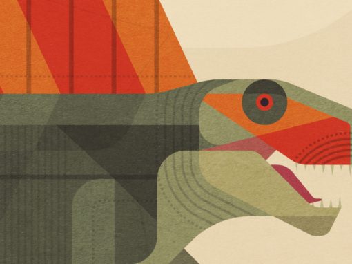
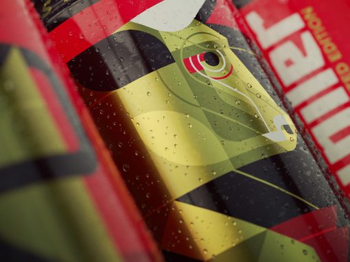
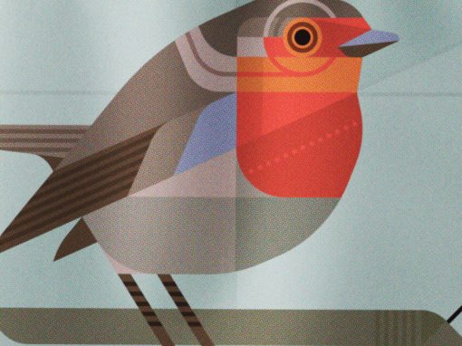
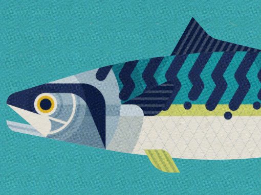
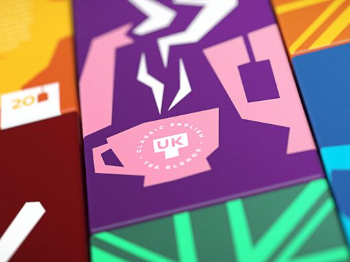
UKT Branding
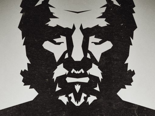
This UKT (United Kingdom Tea) brand is a perfect exercise in the creation of a design that is flexible in both the packaging as well as the derived communication tools. The result is a fresh and colourful design that can be easily adapted depending on the particular flavour and the medium it wich it is used. The “hand cut” paper look allows for the use of bold and striking colours; linked to any particular flavour. This makes the brand look fresh, vibrant and appealing to a younger audience and at the same time, maintains an organic appearance.
CLIENT: Self initiated
CATEGORY: Graphic Design, Illustration


Seen anything you like?
Want to see more?