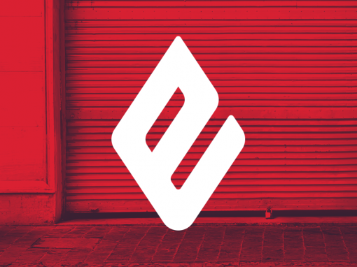
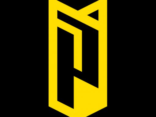
Peute Identity
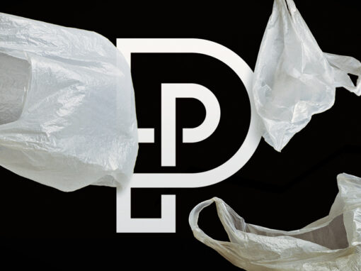
I designed the visual identity for Peute, a company specialising in recycling. In order to stay clear from the well known recycling icon I opted for a typographical approach. By placing a smaller “P” within a larger one (depicting the fact that new resources can be obtained trough recycling/new materials can be found within old ones) and connecting these using a single line I managed to symbolise the continuous cycle of re-using materials. This simple icon combined with basic typography and a bold, black and white colour scheme ensured a strong visual identity.
CLIENT: Peute
CATEGORY: Branding, Identity Design


Seen anything you like?
Want to see more?