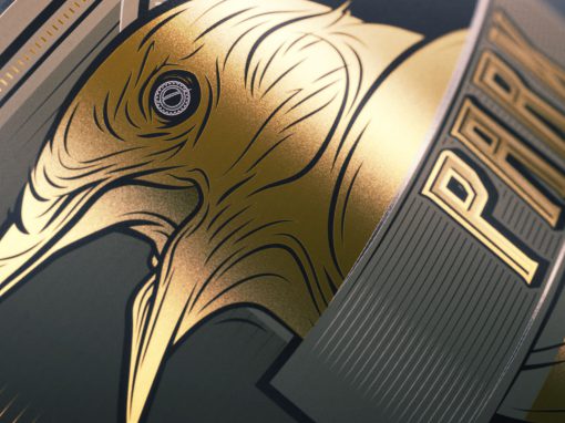
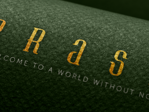
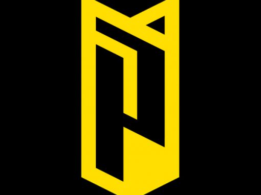
Sarsanszky Identity
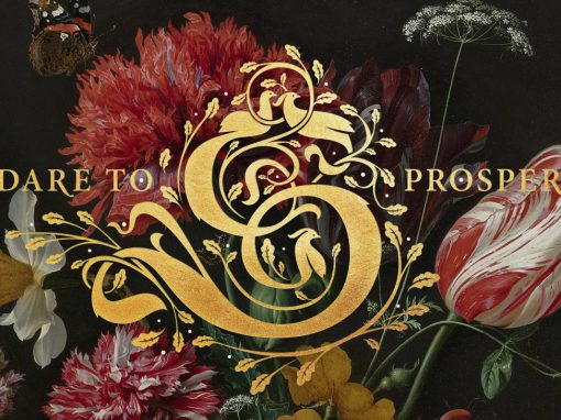
Sarsanszky, a producer of a large range of organic massage oils and skin care products, had a simple brief. Their identity needed to reflect a luxurious yet organic feel and the logo should be based around the letter “S” as a link to the family name.
This resulted in a striking logo around a kapital letter build up out of curving lines with subtle details of leaves and birds. The brands motto “Dare to prosper” was added as well. Wherever possible the logo will be printed in gold adding to the luxuriouse feel. Next to the luscious logo design and classical typography still lives of baroque flower arangements where used as part of the branding, refering to the natural ingredients used in the products, to complete the look and giving it a sence of heritage at the same time.
CLIENT: Sarsanszky
CATEGORY: Branding, Packaging design


Seen anything you like?
Want to see more?