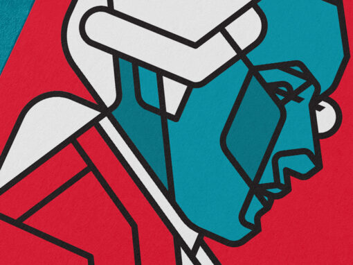
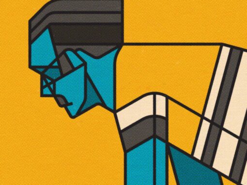
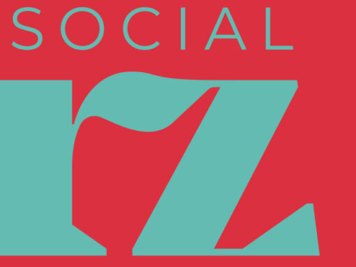
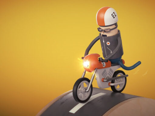
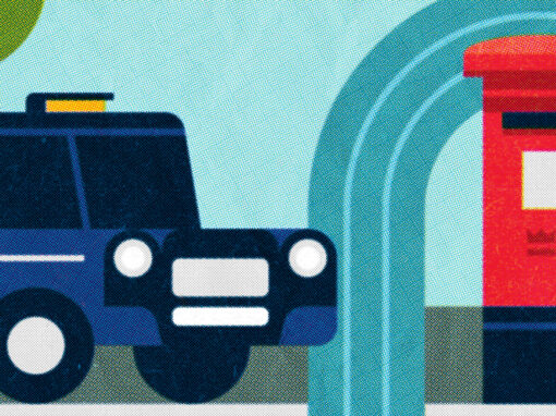
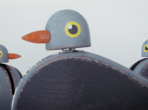
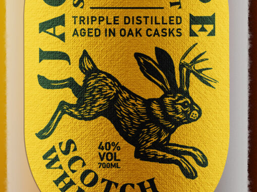
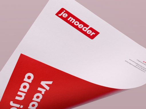
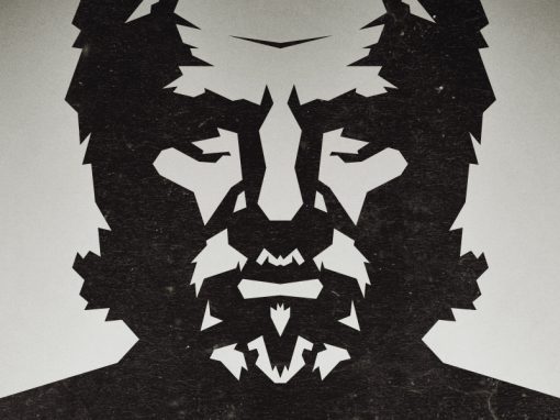
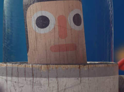
Je Moeder Identity
Who do you turn to help you get trough life, if you have a booboo or just want a hug? Your mother is always there for you. That’s exactly what Je moeder wants to be when it comes to creative productions. So when we designed the logo and visual identity we looked at classic mothers like the ones found in 1960’s-80’s advertising for inspiration. That sence of nostalgia was evoced trough color and basic typography.
CLIENT: Je moeder
CATEGORY: Graphic Design


Seen anything you like?
Want to see more?