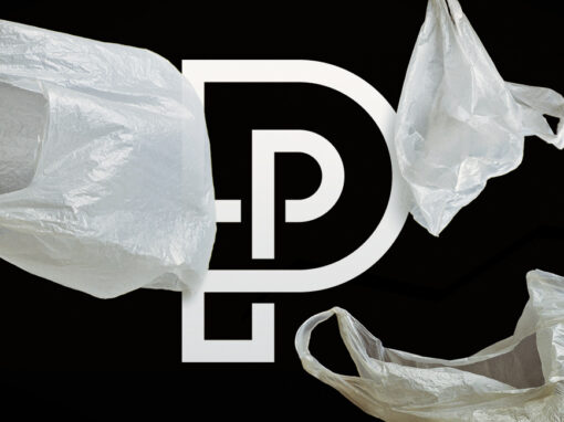
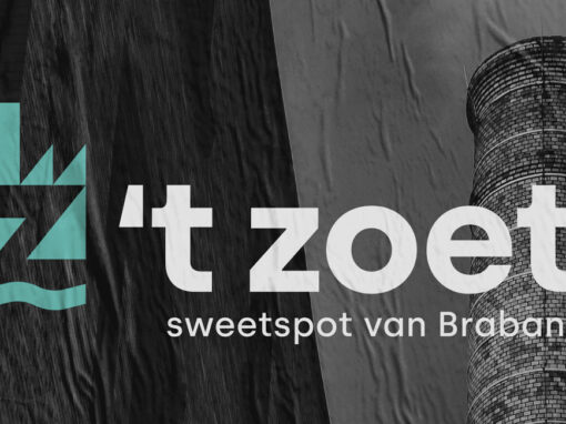
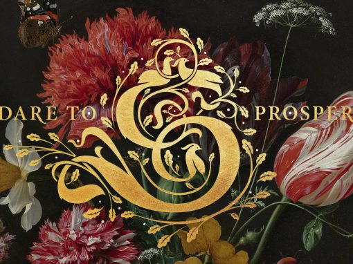
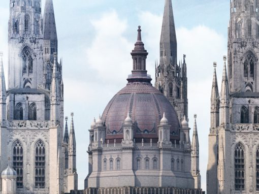
De Bulkenaar Identity
De Bulkenaar is a development area near Roosendaal (the Netherlands) where everything will be based around getting and staying healthy. In these green surroundings a new state of the art hospital will be build together with a number of supporting facilities. The area will invite people to exercise and relax, whether you are in need of care, work in any of the facilities and having a relaxing break or just want to have a stroll. This combination of healthcare and nature needs to be reflected in the area’s visual identity.
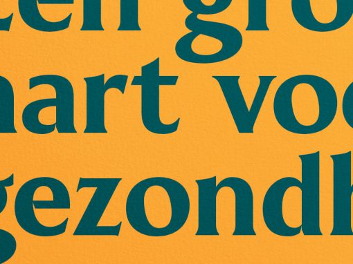
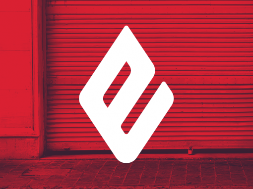
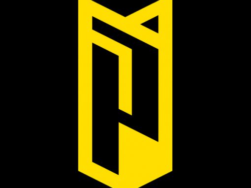
Commissioned by GR8 I designed the base for the graphical identity consisting of a logo, color pallet and selection of typefaces. A minimal representation of a map of the actual area forms the outline of the brand icon. Fictional roads, symbolising the cultivation of the area, where positioned in such a way that the icon is reminiscent of a leaf, reinforcing the connection to nature. Combined with a classical typeface and fresh colors gives the hole a vibrant and modern feel while preserving an authoritarian appearance.
CLIENT: GR8
CATEGORY: Identity design


Seen anything you like?
Want to see more?