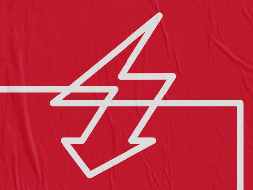
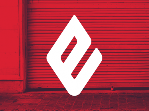
Emmery Identity
As a market leader in fire safety solutions Emmery N.V. was in desperate need of a rebrand. Not just the logo, stationary and website but their fleet of vans, clothing for their employees, labeling systems and packaging as well. In most countries the piping systems for sprinkler and firehose installations are required to be red by law. This is to help firefighters in case of an emergency. This distinct red color was the only limitation in the client’s brief for this project.
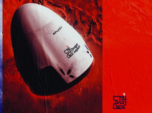
The result is a strong and bold identity based around the letter “E” as a main visual element. Based on an stylised representation of a flame the shape of the letter was altered. This creates a link to fire without the need to show actual flames.
CLIENT: Emmery
CATEGORY: Graphic design, branding


Seen anything you like?
Want to see more?