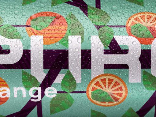
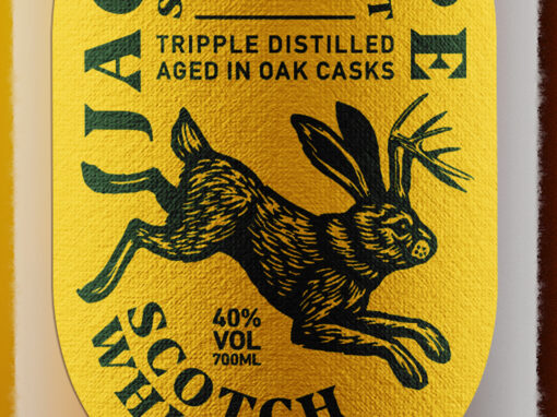
Pure Soda
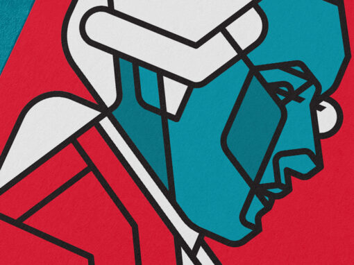
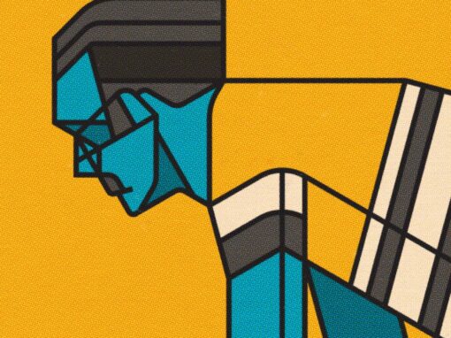
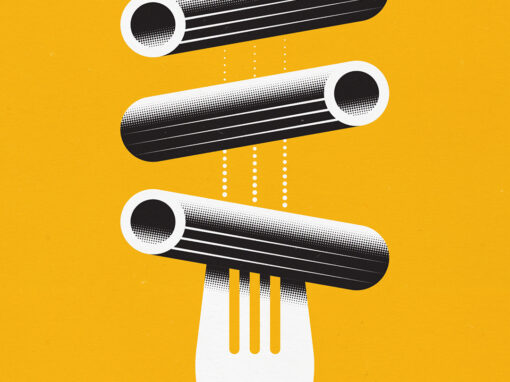
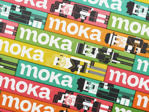
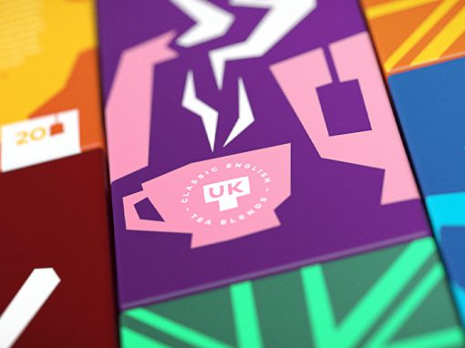
For this design concept I’ve created a number of graphics using a limited set of geometrical shapes and only worked with angles in 30º increments. This principle ensured that the graphics would tie in well together with the logo and that elements between the different illustrations are interchangeable. The result is a harmonious design that’s not only suitable for use on the actual packaging but on many different promotional materials as well. By doing so the recognition with the target audience increases ensuring a familiar feel when they come across the actual product on the store shelf, even if it’s the first time they do.
CLIENT: Self initiated
CATEGORY: Illustration, Packaging Design, Graphic Design
CATEGORY: Illustration, Packaging Design, Graphic Design


Seen anything you like?
Want to see more?