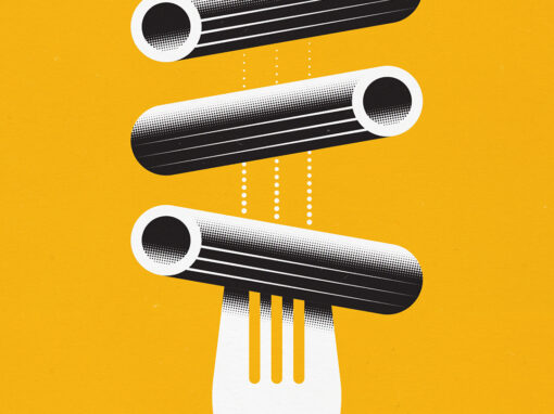
Etrusco Pasta
One could argue that all pasta basically is the same thing apart from its shape. And even though you could consider this to be true, the different shapes and sizes do serve an actual purpose. Depending on the type of sauce you want to serve with your pasta dish, the shapes of the pasta help to absorb the ingredients.
That is why I created a set of illustrations using a distinct visual style using geometrical shapes and a limited colour pallet highlighting the different pasta shapes. Supported by a vivid background colour to help set the different packaging designs apart however ensures they form a strong series as well. As apposed to competing brands who often use the same colour pallet throughout their range of packaging, the Etrusco brand gets a vibrant look despite a nostalgic feel thanks to the use of illustration and typography. This helps to set it apart from the competition, especially on the supermarket’s shelves.
CATEGORY: Illustration, Packaging Design, Graphic Design