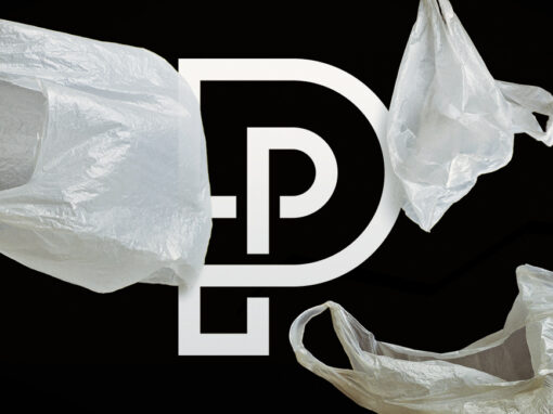
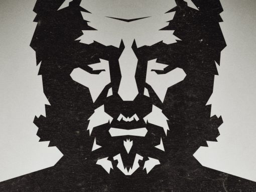
Peugeot rebrand concept
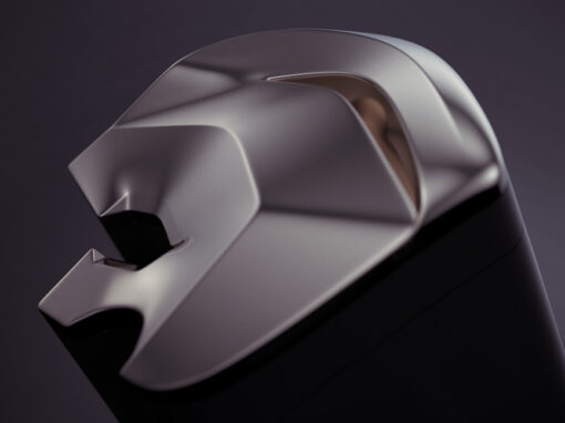
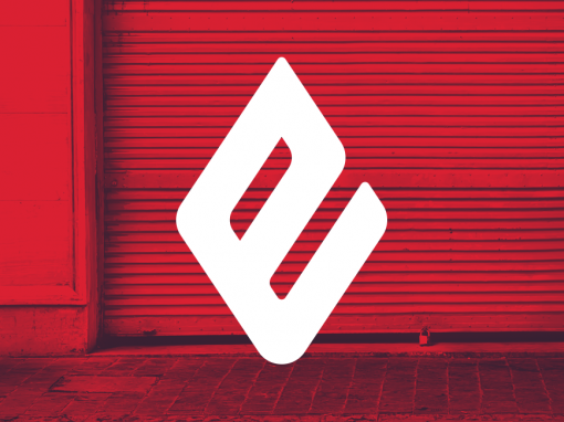
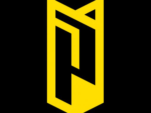
Like many people I’m not a big fan of the new Peugeot logo. Their choice to revive the lion’s head version of the Peugeot logo (as used between 1960 and 1980) is certainly a welcome one. However the execution of the design lacks; In my point of view; the sophistication a modern car brand needs.
So I decided to play around with the design and come up with an alternative. The result is a minimal depiction of the new lion’s head icon and matching typography. Clean lines and curves refer to the previous iteration of the logo (as introduced in 2010) and form a more sculptural piece as apposed to the new official 2020 version.
Whether my version is better or not is of-course a matter of taste or personal preference. As a personal project it was at least an interesting exploration in ways to approach a logo more like a 3D/sculptural object.
CLIENT: Personal project
CATEGORY: Branding, Identity Design


Seen anything you like?
Want to see more?