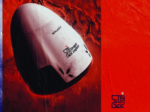
Dragon Capsule Rebrand
Not many things are cooler than rockets and spacetravel. Now that comercial spaceflights and starships are no longer fictitious there’s new ground for strong brands. When i saw SpaceX’s Dragone capsule branding though I felt it lacked sophistication. So I started working on a rebrand.
The dragon icon was an obviouse choice. Pairing it with minimal typography that reflect the linework in the icon give the design a sober and high quality feel. The spacecraft was the first manned launche from America in almost 10 years. So I used the red and blue colourskeme from the American flag.
CLIENT: Self initiated
CATEGORY: Graphic design


Seen anything you like?
Want to see more?