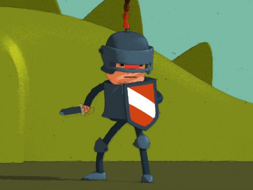
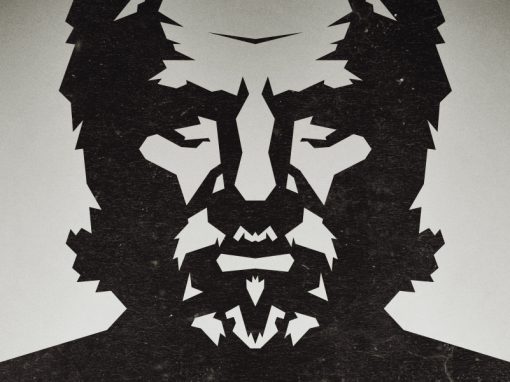
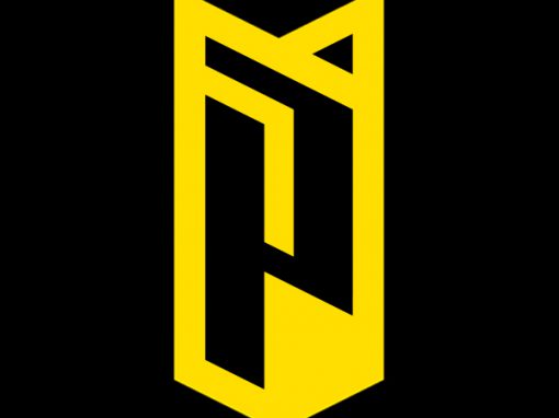
Be Robinson Identity
The logo needed to reflect the agency’s specialty in basic, adventurous traveling. This was achieved through the use of a bold, engaging icon portraying a Robinson like character, the use of mostly strait lines and a dominant black color. The simplicity of it’s shape and the use of just one color also allowed the logo to be applied to any form of media and branded object in a cost effective way.
CLIENT: Be Robinson
CATEGORY: Logo design, Branding, Identit


Seen anything you like?
Want to see more?